
MTN Pulse App Redesign
Overview
MTN is the largest telecommunications company in Africa, headquartered in South Africa. It provides a complete suite of services including calls, data, broadband, mobile money, etc. It created an app to target and engage its youthful customers in order to gain loyalty and that would make them grow and have an attachment to the brand.
MTN Pulse is a product that has been incredibly successful for MTN in Ghana thanks to the exclusive features linked to the product (e.g. mashup, loyalty etc.) After releasing the app for 2 years, data showed that the app had a drop in subscriptions, transactions and active usage during the period and therefore was not meeting the expected targets.
I joined the development as a product design consultant to improve the experience and overall get better outcomes.
Role
I lead the end-to-end design process for the app development team through a user-centred method. My responsibilities include User Research, Interviews, Usability Testing, UX Analysis, Wireframing, Prototyping, Refinement.
Duration
May 2019-January 2022
Company
MTN GHANA
Tools
Figma
Balsamiq
Overflow
Photoshop
Trello
The Problem
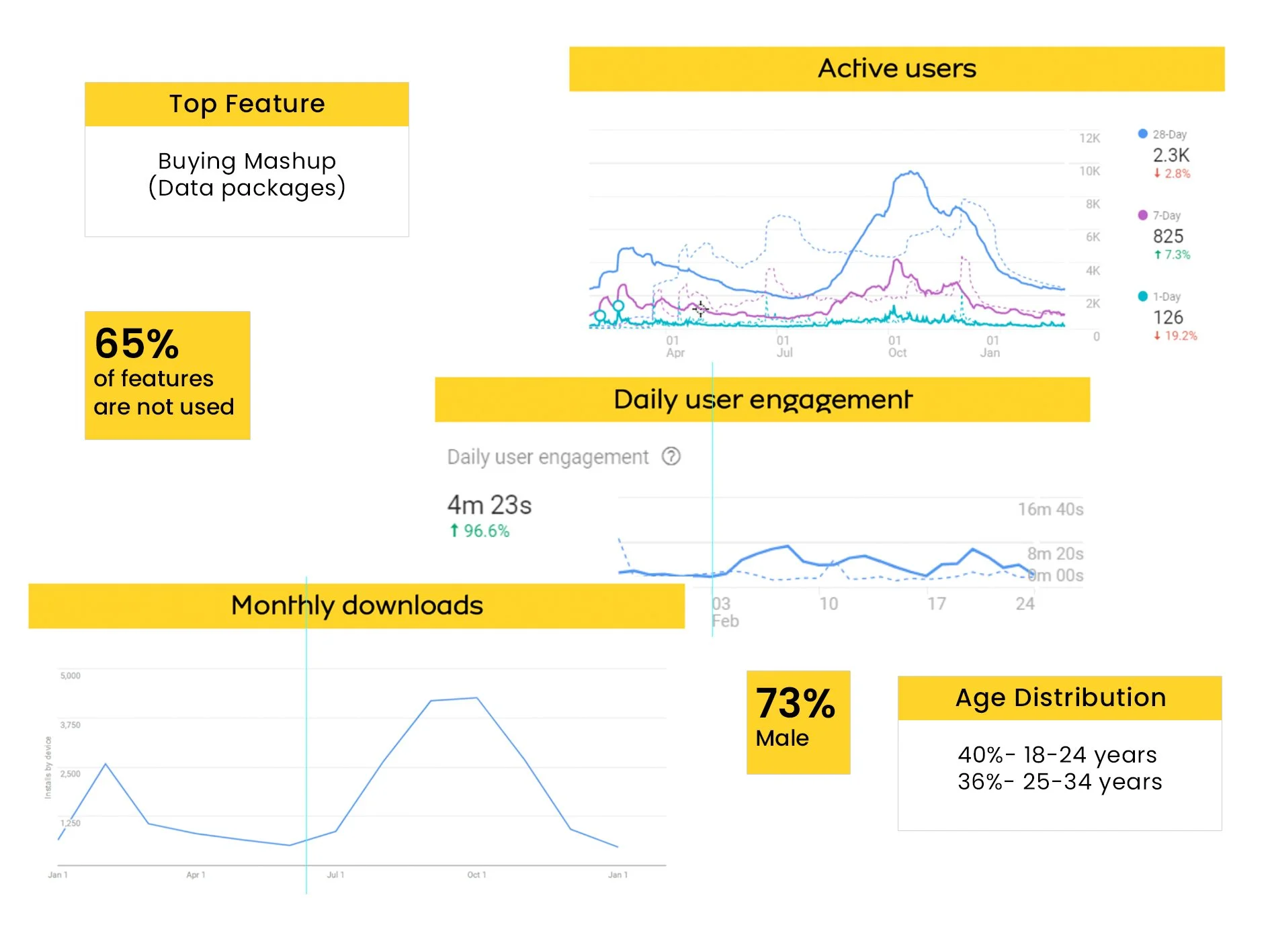
The app was first launched in 2017. Through its 2 year period they realised that the existing digital experience is not fit for purpose and has a very low take-up that is less than 3k active users per month on average.
I held meetings with the Chief Digital Officer and Product Manager of the Pulse app for a better understanding of their product and to find the intersection between business goals, user needs and technology constraints. This enabled me to properly streamline the problem and the goals to be achieved on this project.
The Goal
High-Level Goal
Create a distinctive digital experience for the Youth segment to make MTN the brand of choice for all customers under 30 years old.
Approach
A complete revamp of the digital experience will be required to remain relevant for the youth segment. This includes not only the app but it should also covering all the other digital channels.
Analysis and Assessment of the current state of the system
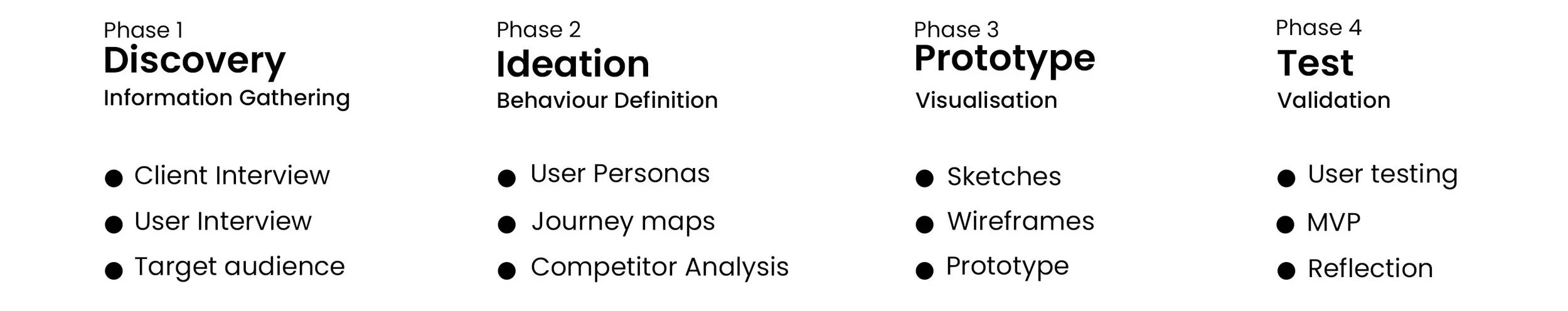
The design process started off with a plan to interview a number of existing users of the app.
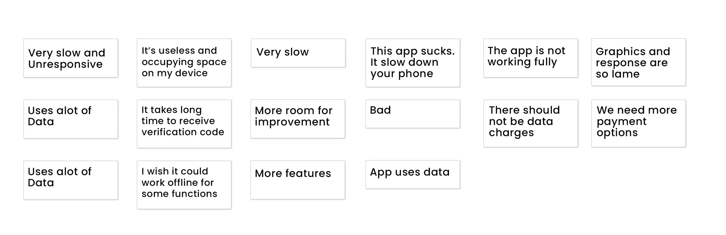
I leveraged user research and testing to validate any solutions before any redesigning. We conducted different interviews to identify pain points, Opportunity and insights. I found patterns in users perceptions and tasks.
Key Findings
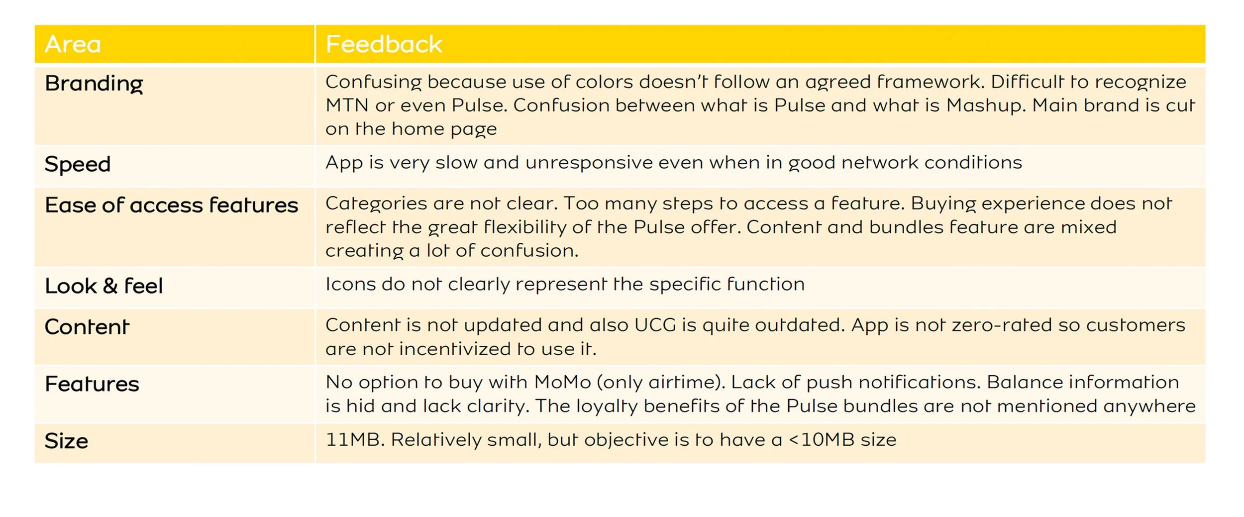
The quality of the app experience was not aligned with the experience provided by other applications used by the youth segments and this created a huge barrier to getting repeated users.
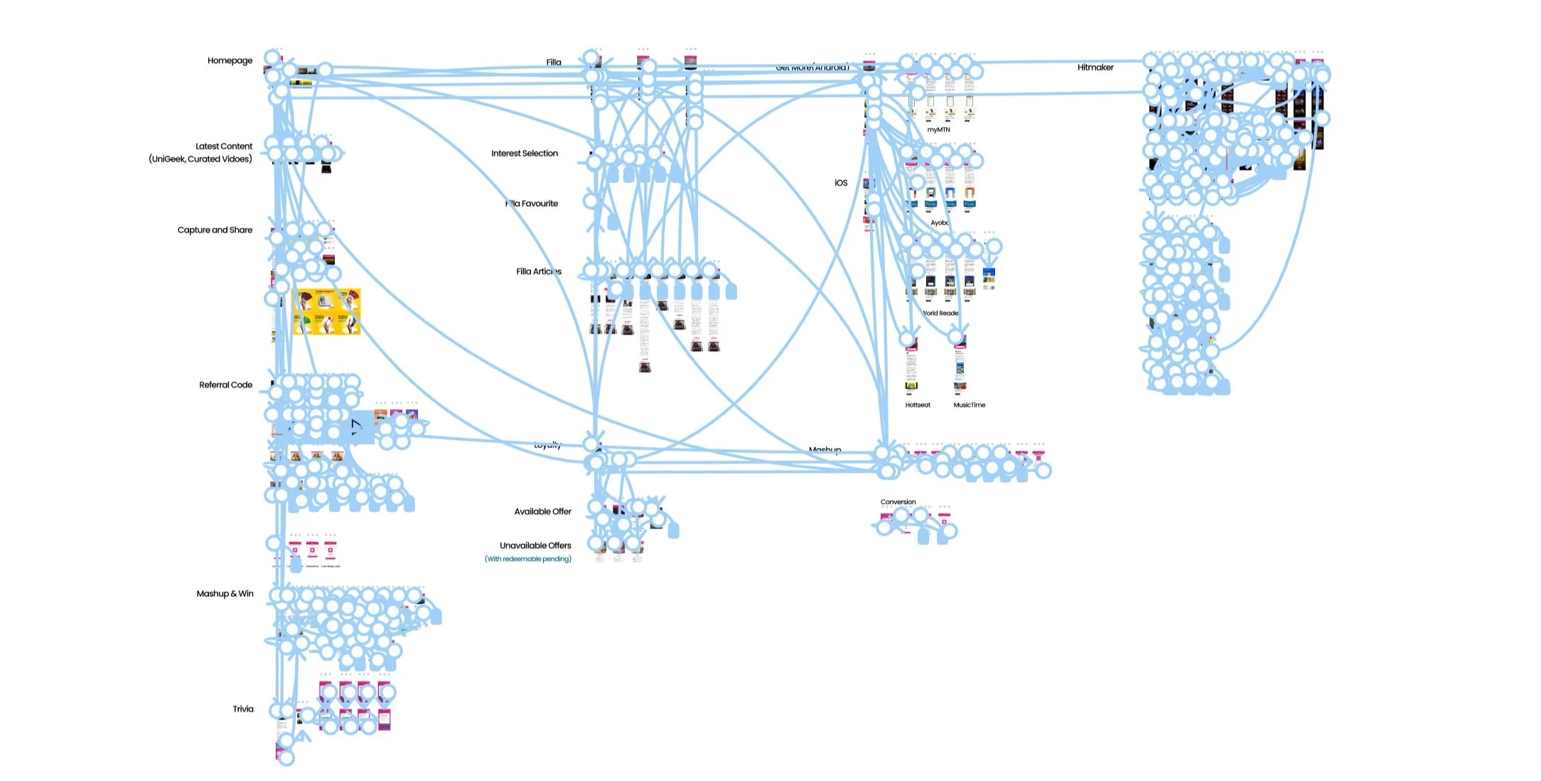
Information Architecture
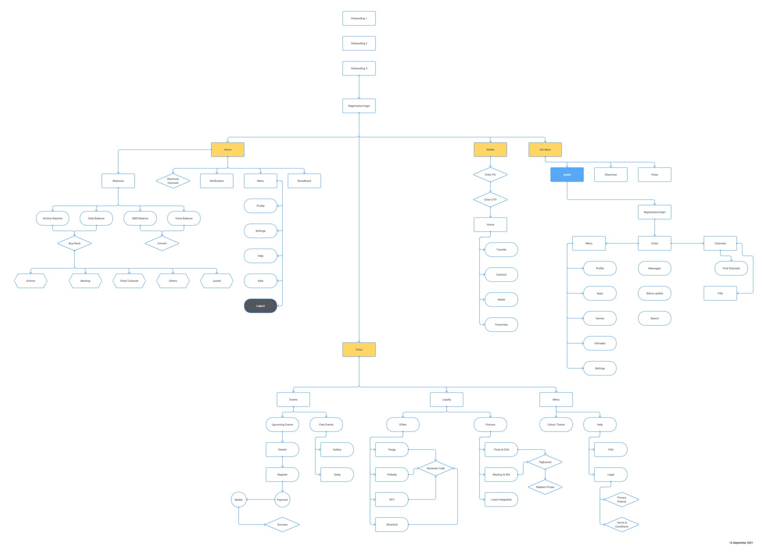
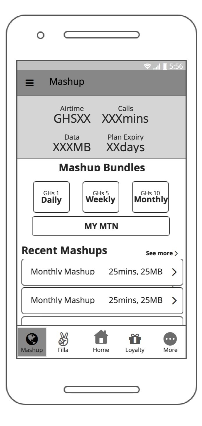
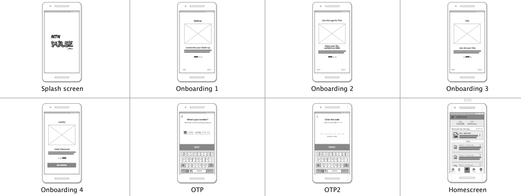
Wireframes
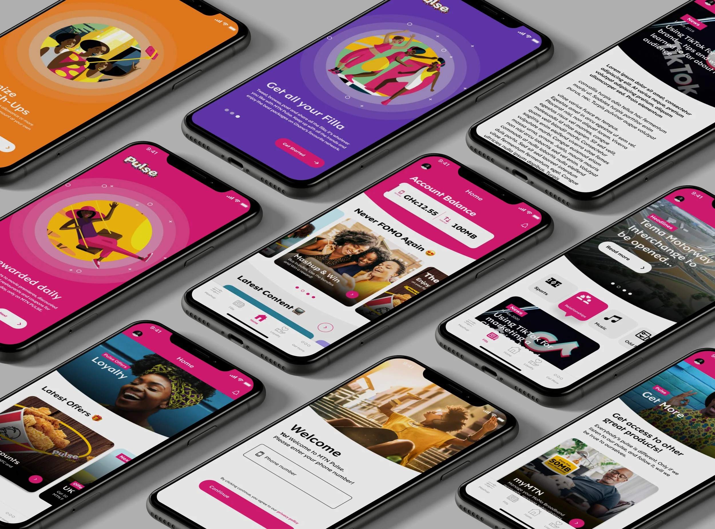
Old App Screens
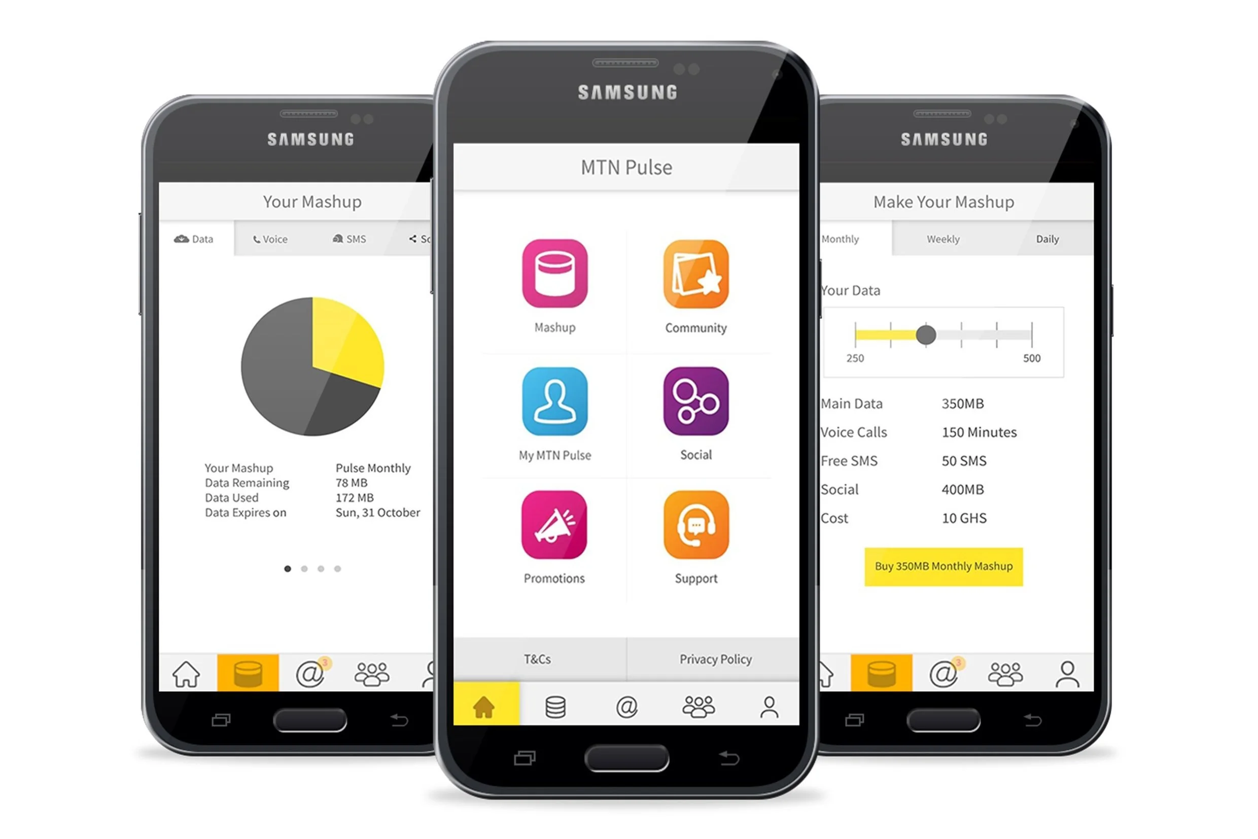
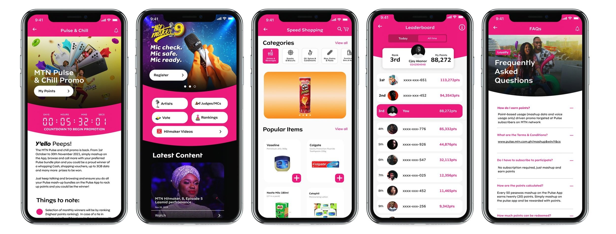
Visual Screens
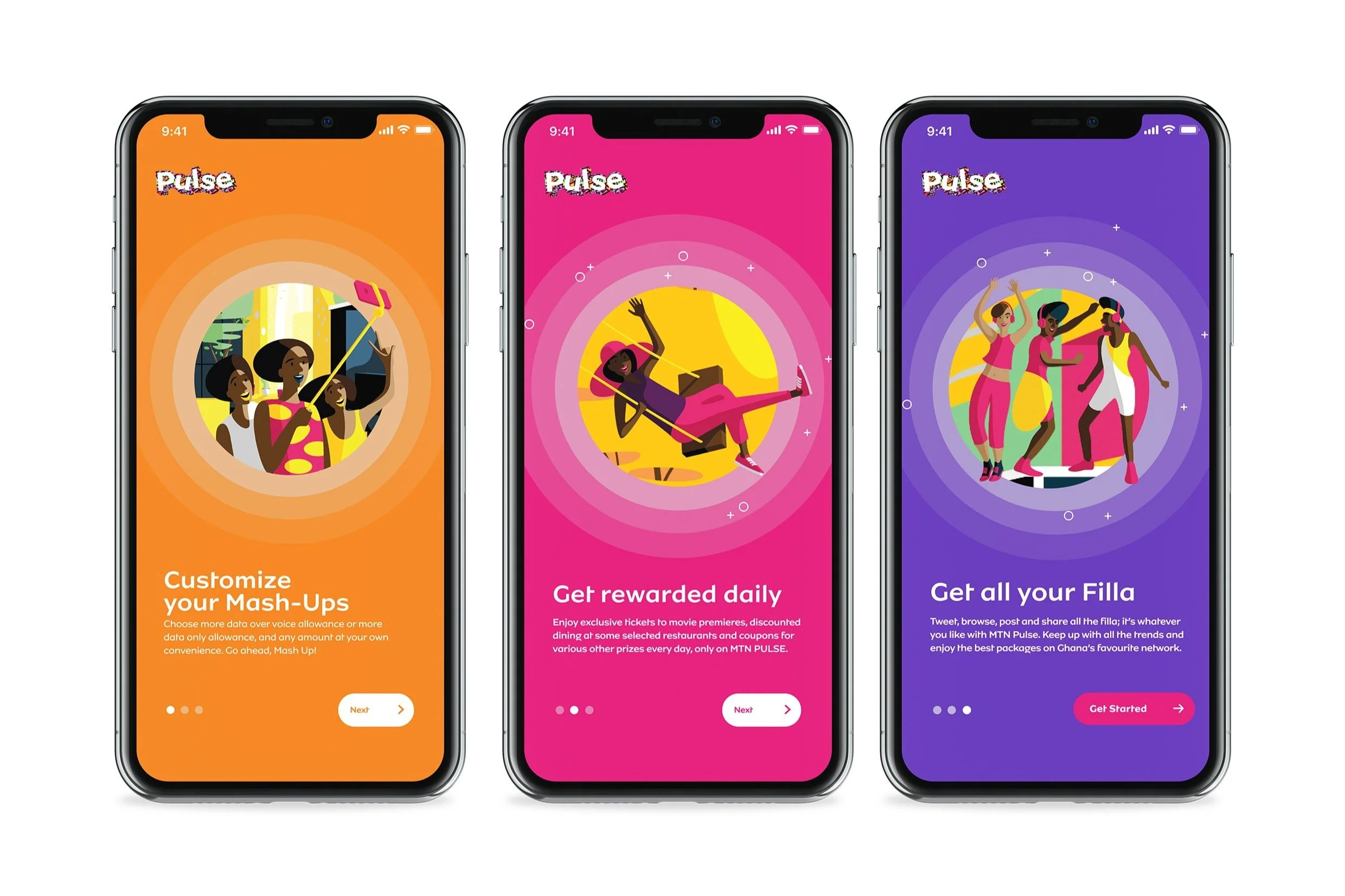
Walkthroughs
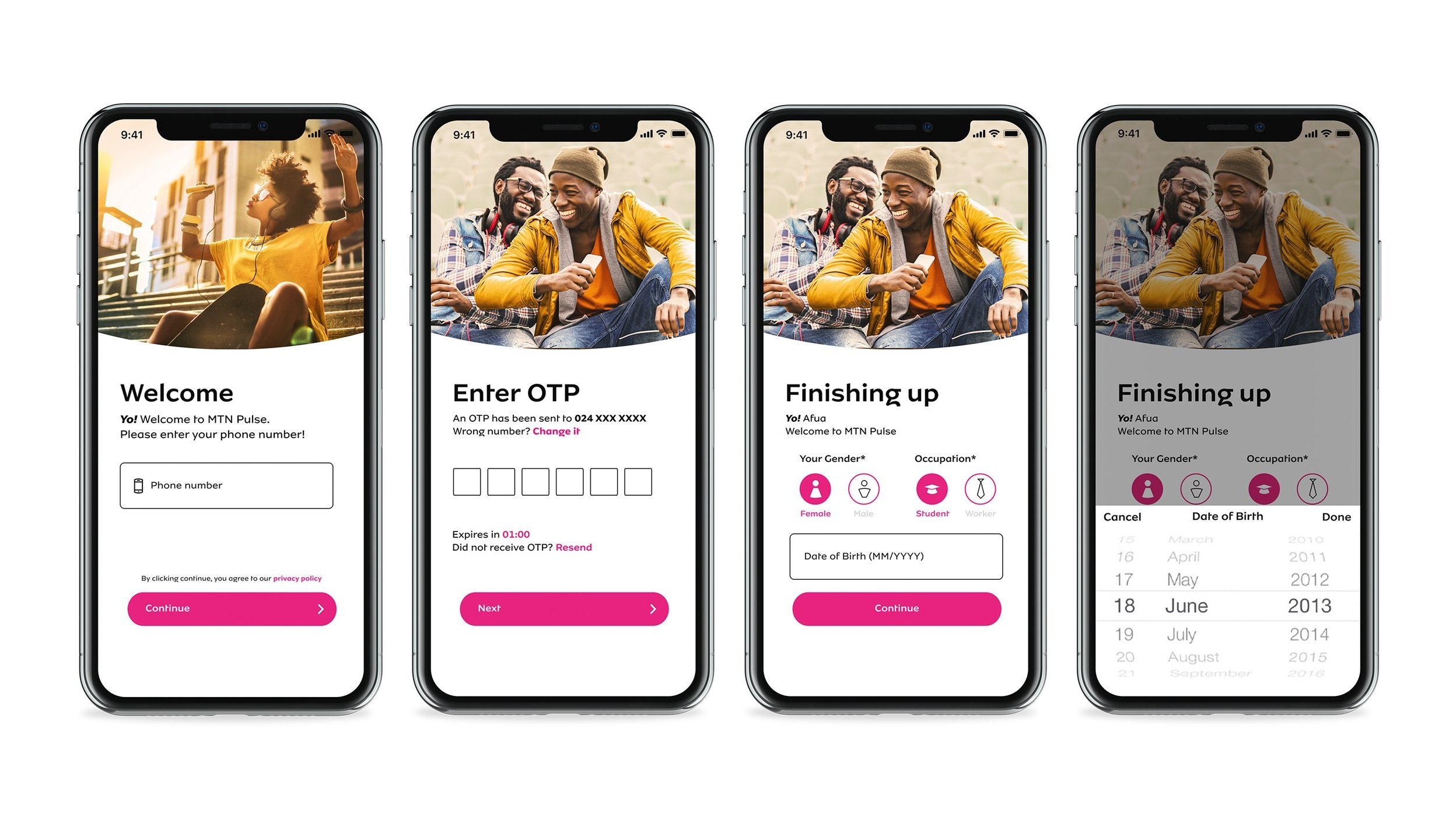
2. Login/Signup
3. Main Activity (Bottom Navigations)
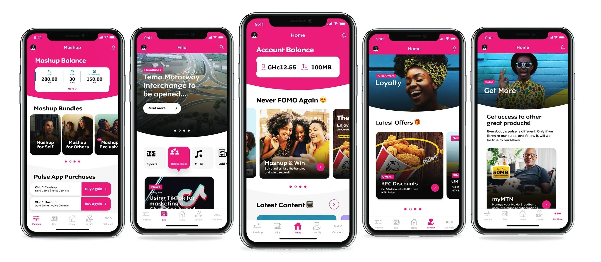
4. Miscellaneous
5. Figma screens interactive prototyping
Challenges
Introducing users to the MTN Pulse
I wouldn't be exactly truthful if I say we aren't nervous about how the greater population will react to the new style of the redesign. But whatever their reaction, we're ready to learn from it. As a failsafe, we've ensured that the design also has enough flexibility to change the entire app's colour theme.
Delayed loyalty program
MTN Pulse’s new loyalty program was a big feature of the new app. While the loyalty program did not launch with the MVP, our designs had to be flexible enough to scale once we added it in. We had to design this entire app with consideration for a feature we knew very little about, requiring us to consider how certain components can be used in multiple ways, and how layouts can be altered to fit a new layer of information.